I paused my blog project after my DNS (Did Not Start) at the 2021 Grandma’s Marathon. In the four months following my hamstring injury, every time I tried a test run the result was intense pain in the back of my right thigh that stopped me after a short distance. Throughout these months, I walked as much as I could, did recommended strength training, and had many chiropractic treatment sessions (ART, Active Release Technique) for sciatic nerve “adhesions” resulting from my body’s hamstring repair job (my chiropractor’s diagnosis). Then, miraculously, the pain went away early in the fall. I think the last ART session – “Really deep, hurt my fingers,” he said – may be what saved me.
For the rest of 2021 and most (not all, alas) of 2022 I was, once again, a happy runner.
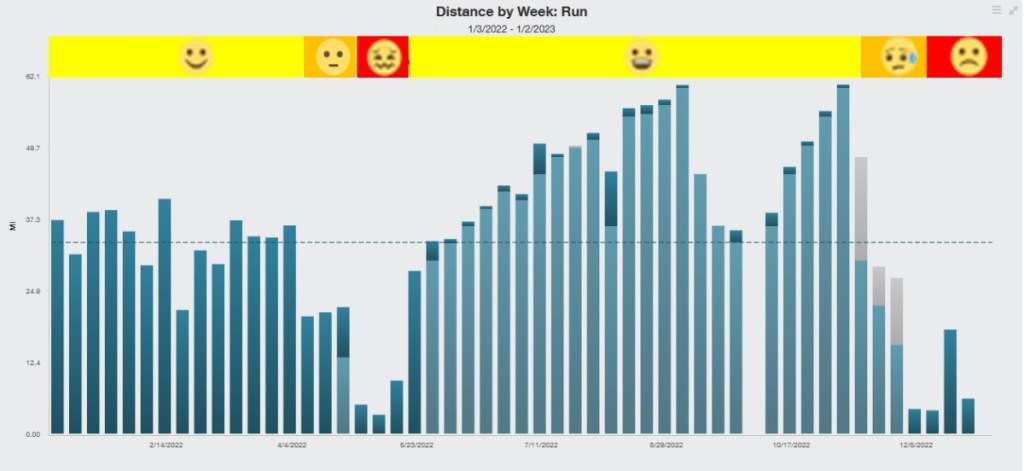
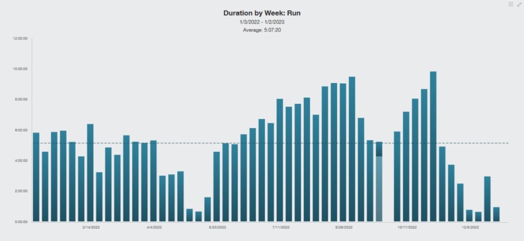
Graphs 1 and 2 summarize my 2022 running. The underlying graph in each was created with TrainingPeaksTM (TP) software.
Graph 1 is a bar graph showing the number of miles I ran each week. I added a color-coded bar with emojis at the top to show how happy I was about my running:
- Running regularly again: January to first week of April. My running happiness was high. I had worked up to regularly running about 30 miles per week or a little more. Late in this period, I started thinking it ought to be possible to train for a fall marathon. I registered for the St. George Marathon, a race in Utah that was highly recommended by some running friends, and decided to use an online coaching program – something I had never tried.
- Adductor injury period: the last three weeks of April and first three of May. I started to experience pain from my right adductor muscles (muscle tear, with extensive bruise — got to watch the progression of bruise extent and color changes), reduced my mileage and then, when the pain increased, stopped running except for some “test runs” to see how things were progressing.
- Marathon training period: adductor muscles healed and I started following an online coaching plan for St. George. Running happiness was very high! The plan steadily progressed my mileage and included weekly fast runs (e.g., sets of one, two, or three mile intervals) and hill runs. I joined my old running club for progressively longer Saturday runs and ended up running a lot with two people who had also signed up for the St. George Marathon. My “peak week,” three weeks out, was a little over 60 miles in total, including a very happy 20-mile group run along part of the final stretch of the Twin Cities Marathon.
- St. George Marathon, October 1st. A little disappointed in my overall performance and thought I could have done much better if I had made smarter decisions. Very interesting part of the country to visit!
- Resumed training for another marathon, the California International Marathon (CIM) in Sacramento on December 4th (had another reason for being there). Running happiness still very high until something went wrong at the end of my first “taper week,” two weeks out: posterior tibialis tendonitis (see more in my next blog post). I had to cancel my plan to run CIM and am still working on recovery from this injury.
Graph 2 uses the TP Performance Management Chart (PMC) for the same 12 months as Graph 1. This tracks proprietary metrics TP calculated from data automatically uploaded from my Garmin running watch after every run. I added the same color-coded bar with emojis to plot my running happiness through the year. TP provides a simple introduction to their PMC at: What is the Performance Management Chart? | TrainingPeaks, with links to more information about their software and services.
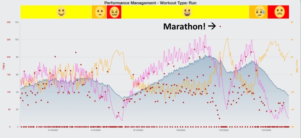
I find that tracking these metrics provides useful insights and is also motivating:
- A red dot is plotted for each day (X-axis) to show the Training Stress Score (TSS) (Y-axis) for that day, calculated from the duration of my run and how intense it was relative to the intensity of my estimated “threshold pace.” The red dots appear at the bottom on days I did not run (TSS = 0).
- In my case, intensity was measured by a StrydTM power meter clipped on one of my running shoes. The Stryd device communicates with the running watch, which sends the power data to TP, along with GPS-derived route, distance, time, pace, cadence, elevation change, and heart rate data. (I usually wear a chest strap heart rate monitor because my built-in Garmin wrist monitor is very inaccurate – most often, I think, due to interference from cadence.)
- Instead of using power, TP can alternatively calculate a TSS using heart rate data (calls this metric “hrTSS”) or from pace plus elevation change data (“rTSS”).
- The blue line (with lighter blue underfill) is a plot of Chronic Training Load (CTL), which TP also calls “Fitness.”
- CTL is an “exponentially weighted average” of TSS during the preceding 42 days of training (more recent runs have more weight).
- TP says this “reflects the training you have done over the last 3 months.”
- The purple line is a plot of Acute Training Load (ATL), which TP also calls “Fatigue.”
- ATL is an “exponentially weighted average” of TSS during the preceding seven days.
- TP says is “an estimate of your fatigue accounting for the workouts you have done in the past two weeks.”
- You can see that my ATL went way down during my adductor muscles injury episode, St. George Marathon taper and recovery, and after my posterior tibialis tendon injury. My ATL plot was rather flat during the first part of the year (base training) and steadily rising during my most of my training before the St. George and (hoped for) Sacramento marathon.
- Observation: I have found that “Fatigue” seems to correlate well with my “Running Happiness.” When ATL goes down, my running happiness declines and vice versa.
- Finally, the yellow line a plot of Training Stress Balance (TSB), which TP also calls “Form.”
- TSB is calculated by subtracting the preceding day’s ATL from the preceding day’s CTL. (“Fitness minus Fatigue equals Form.”)
- TP says, “by tapering you can shed fatigue at a greater rate than you lose fitness and come into form on the day that matters most… race day!”
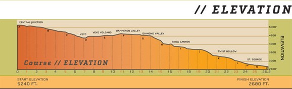
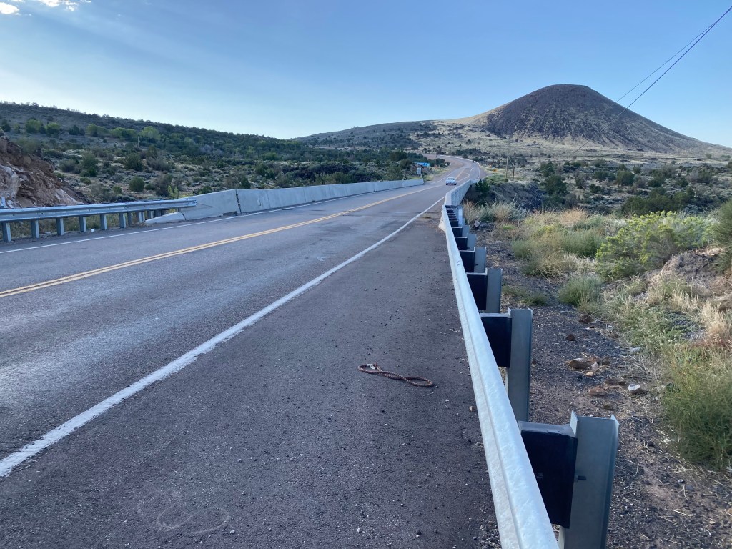
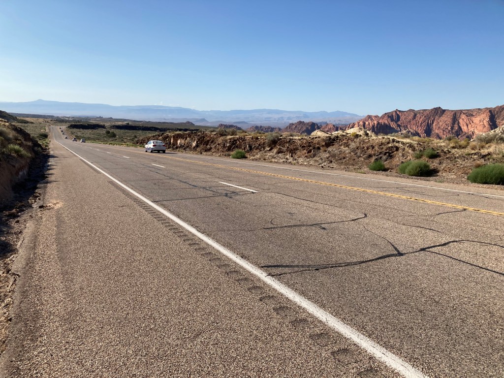
The St. George Marathon is a downhill course with a huge net elevation drop: 2,560 feet from 5,240 at the start in Central, Utah, to 2,680 at the finish in St. George, per the official race information shown in Graph #3. There is a steep hill starting around mile seven where the road goes around the Veyo volcano, then it is more gently uphill or flat for about the next seven miles. About two-thirds is downhill.
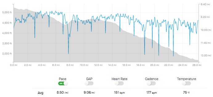
Graph #4 (from Garmin data) summarizes my performance (and inaccurately shows even more of an elevation drop). The 15 sharp downward spikes in my pace mark the “Aid stations” where I slowed to a walk to drink. I only took one plastic cup of water or Gatorade at each station (almost always just water, which was probably stupid, because my stomach was upset). I did not think of grabbing a second cup, which was probably a big mistake because I became extremely dehydrated by late in the race when the temperatures had risen to over 90 degrees F. Another big mistake I made was not being prepared for how chilly it was waiting for the race to start. I was assigned to a 4:00 a.m. bus departure for the starting line, then had to wait up there for two and half hours for the start (7:00 a.m.). It was something like 50 degrees and windy. I kept warm huddling around one of the bonfires they had (dodging glowing embers that blew my direction every now and then) until they made last call for gear bags (clothing runners wanted sent to the finish area) at 6:20 a.m. I had not brought any “throw away” clothing so I ended up shivering hard for at least twenty minutes while lined up behind the starting line. One other mistake: wrong shoes (or maybe just suboptimal lacing?) for running downhill for so long. My toes really hurt during the last half of the race. I developed a “subungual hematoma” (bleeding under the nail) on one big toe and later lost the toenail (it seems to be growing back well, though).
My final graph shows the number of hours I spent running each week during the year, not including the time it took to prepare for and recover from the runs or travel time to the running location when it was not straight out my door. The weekly average for the entire year was a little over five hours running, with four weeks that had more than nine hours. For me, this training was by far a much, much bigger thing than the one race I ran! It is the training that gave me so much joy and, I think, did so much good for my health. Nevertheless, I find that preparing for a big race — ideally in an interesting location — helps enormously to structure and motivate a training program.


Leave a comment